Since its inception in 1963, Doctor Who has captivated audiences worldwide with its time-traveling adventures and iconic imagery. Central to the show’s visual identity is its logo, a symbol that has undergone numerous transformations, reflecting the different eras and tones of this enduring science fiction phenomenon. Let’s delve into the fascinating history of the Doctor Who Logos, tracing their evolution from the eerie beginnings to the dynamic designs of today.
 Doctor Who Logo
1963 – 1967: The Ghostly Start
The original Doctor Who logo, introduced with the very first episode, was remarkably simple yet effective in establishing a mysterious and otherworldly atmosphere. Designed to evoke a sense of the supernatural and anticipation of the unknown, the logo featured semi-transparent white letters against a dark background. This created a “ghostly” effect, further emphasized by abstract white shapes subtly incorporated into the backdrop.
The font used was Grotesque One Three. Interestingly, while the word “who” was significantly taller than “doctor,” both words maintained the same width, contributing to the logo’s unique, slightly unsettling aesthetic. This initial logo served the show until 1967, last appearing at the start of “The Moonbase.”
 Doctor Who Logo 1963
1967 – 1970: Times New Roman Era
Debuting in Patrick Troughton’s era with “The Macra Terror” in 1967, the second iteration of the Doctor Who logo maintained a ghostly quality through the continued use of semi-transparent white against black. However, the sans-serif Grotesque One Three font was replaced with the more conventional Times New Roman. Similar to its predecessor, “doctor” and “who” shared the same width but differed in height, retaining a visual link to the original design while adopting a more formal typeface. This logo accompanied the Second Doctor’s adventures until the dawn of the 1970s.
 Doctor Who Logo 1967
1970 – 1973: Color and Contrast
A significant shift occurred in 1970 with a logo designed specifically for the series’ first color broadcast. This update embraced a striking contrast between black and a vibrant, luminescent cyan. While the color change was dramatic, the typography also underwent a major transformation, becoming far more distinctive and memorable. The generic Times New Roman was abandoned in favor of a bolder, custom typeface. This new font featured irregular elements, giving the letters a somewhat distorted and futuristic appearance, perfectly aligning with the show’s science fiction themes. This logo became synonymous with the Third Doctor’s era.
 Doctor Who Logo 1970
1973 – 1980: The Diamond Logo
The logo took another turn in 1973, becoming significantly more subdued and earning the nickname “diamond logo.” Introduced in “The Time Warrior,” the first episode featuring Sarah Jane Smith, this design resembled a glowing LED signboard. The word “doctor” appeared in arched, light letters, while “Who” was presented as an outline, both contrasting against a deep indigo fill. A bluish square subtly framed the design in many iterations. While color variations existed, shades of blue generally dominated this logo, creating a cooler, more technological feel. A version without the background square was also occasionally used.
 Doctor Who Logo 1973
1980 – 1984: Night Sky Signboard
Building upon the “signboard” aesthetic, the 1980 logo further enhanced this impression. The letter outlines became even brighter and more luminous, while the background deepened into a representation of the night sky, complete with stars. First seen in “The Leisure Hive,” this logo served as the visual identifier throughout the Fifth Doctor’s tenure, evoking a sense of cosmic adventure and wonder.
 Doctor Who Logo 1980
1984 – 1986: Purplish Starfield
A more subtle update arrived in 1984. While maintaining the core design elements of the previous logo, the color of the LED outline shifted to a more saturated, purplish hue. This color change harmonized perfectly with the “star-field” title sequences of the time, adding a touch of dramatic flair and visual richness.
 Doctor Who Logo 1984
1987 – 1989: Bold Purple and Handwritten
A complete departure from previous styles marked the 1987 logo, designed for the Seventh Doctor’s era. This design featured a large, bold, purple “Who” in block capital letters. Complementing this was the word “Doctor” rendered in a yellow, handwritten style script. Created by renowned American graphic designer Oliver Elmes, known for his work on various BBC projects, this logo offered a more contemporary and dynamic feel, signaling a shift in the show’s visual presentation.
 Doctor Who Logo 1987
1996: Inspired by the 70s
The 1996 Doctor Who TV movie logo drew inspiration from the iconic 1970-1973 design, yet with a modern twist. This iteration incorporated a greater sense of depth and dimensionality, while the letters were rendered in various shades of blue. This logo served as a bridge between the classic and modern eras of Doctor Who, hinting at a revival while acknowledging its rich history.
 Doctor Who Logo 1996
2005 – 2006: Shield Logo
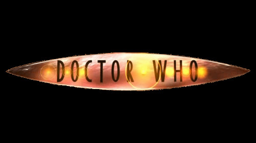
The relaunch of Doctor Who in 2005 with the Ninth Doctor ushered in a completely new logo era. This design placed thinner lettering within a shield shape, which itself resembled either an eye or a UFO, adding layers of symbolism. For the first time, “Doctor” and “Who” were positioned horizontally on a single line. Over ten variations of this logo were used, primarily experimenting with color palettes while maintaining the core shield shape, demonstrating the logo’s adaptability.
 Doctor Who Logo 2005
2006 – 2010: Fiery Eye
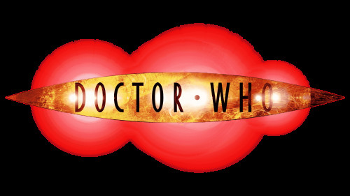
Continuing the shield motif, the 2006 logo, used from series 2 through 5, retained the eye-like foundation but introduced fiery effects within the shield. The background also shifted to a predominantly red color, creating a more intense and dynamic visual. This logo, associated with the Tenth Doctor, amplified the sense of adventure and drama.
 Doctor Who Logo 2006
2010 – 2012: DW Emblem
A further evolution in 2010 saw the logo split into two distinct parts: the “DW” emblem and the full “Doctor Who” lettering. The “DW” emblem’s shape clearly referenced the TARDIS, the Doctor’s iconic time-traveling spaceship disguised as a blue police box. This logo, associated with the Eleventh Doctor, cleverly integrated a key visual element of the show directly into its branding.
 Doctor Who Logo 2010
2012 (Scrapped)
An initial logo design for series 7 in 2012 was ultimately scrapped but elements of its design were carried over to the final version. This early concept featured tall, bulky letters for “Doctor Who” with small serifs, rendered in a brown color to resemble dead LED lights. The background was typically bright yellow with red accents. While short-lived, this design represents an interesting, darker direction explored during the logo development process.
 Doctor Who Logo 2012
2012 – 2013: No DW Emblem
While the typography for “Doctor Who” remained largely consistent with the scrapped 2012 design, the “DW” emblem was removed in the finalized logo for 2012-2013. Designers focused on experimenting with different color combinations for both the insignia and the background throughout this period, demonstrating a continued refinement of the visual identity.
 Doctor Who Logo 2012-2013
2014 – 2018: Calmer Blue
Introduced in the “Deep Breath” story, the 2014 logo adopted a calmer, bluish design. While utilizing the same typography established in 2012, the thinner, rounded shapes and cooler color palette created a distinct visual shift, conveying a more refined and perhaps slightly melancholic tone, fitting the Twelfth Doctor’s era.
 Doctor Who Logo 2014
2018 – 2021: Thin and Recognizable
The 2018 logo, developed by design agency Little Hawk, featured thinner glyphs with enhanced recognizability. This was achieved partly through the addition of horizontal strokes on letters like “D,” “H,” and “O.” This logo aimed for a more modern and streamlined aesthetic, balancing contemporary design with the show’s established visual language.
 Doctor Who Logo 2018
2021 – 2022: Cleaned Up
A subtle redesign in 2021 refined the 2018 logo by cleaning up the character contours, slightly enlarging the letters, and increasing the spacing between them. This “cleaned up” version provided improved readability and visual breathing room. The corporate BBC insignia above the badge was also slightly enlarged, maintaining brand consistency.
 Doctor Who Logo 2021
2022 – Present: Shield Badge
The most recent logo, introduced in 2022, marks a significant departure and a bold new direction. Built around a shield-shaped badge in a bright, deep blue, the design features “Doctor” arched in gray uppercase letters across the top of the shield. The enlarged word “Who” is prominently placed in the shield’s center, outlined in a glowing yellow. This combination creates a dynamic and vivid badge, symbolizing strength, authority, and the enduring legacy of Doctor Who.
 Doctor Who Logo
Font Evolution
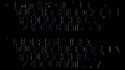
The fonts used in Doctor Who logos have evolved significantly over time. The initial logos utilized Grotesque One Three and Times New Roman. Later iterations embraced more unique and custom typefaces. The 2018 logo, for example, is based on a modified version of the Gotham typeface, reflecting a trend towards modern and adaptable fonts. The current logo uses a custom sans-serif font, with potential similarities to Lemon Milk Pro Light or Meroche Medium, showcasing clean lines and elongated bars.
 Doctor Who Font
Color Palette Through the Decades
From the monochrome beginnings to the vibrant color palettes of recent years, the Doctor Who logo has explored a wide spectrum of colors. The initial black and white designs gave way to color in 1970, and since then, designers have experimented extensively with hues, contrasts, and gradients to reflect the tone and style of each era of the show. The current logo’s use of blue, gray, and yellow creates a visually striking and memorable combination.
In conclusion, the history of Doctor Who logos is a visual journey through the show’s remarkable longevity and constant reinvention. Each logo reflects not only the aesthetic trends of its time but also the evolving spirit of Doctor Who itself, ensuring that this iconic symbol remains as timeless and dynamic as the Doctor’s adventures through time and space.
